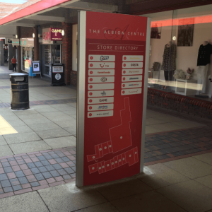
Wayfinding signage is often referred to as “directional” signage at some parts of the world, for the simple reason it helps direct traffic of people moving from point A to point B in shared spaces. Be it transit stations or airports, public buildings, malls, shopping centers, hospitals or campuses – directional signage is key.
Directory signs are often called that way because they seem to concentrate a great deal of information into a wall frame, often strategically located for all to see.
People are searching for these signs for better orientation in the space. It is a way of reassuring and providing a sense of control to visitors.
These examples of Vista System directories prove again how truly functional and versatile they are. Each of these projects found these frames simple and easy to use; Enabling quick graphic replacement; easily seen from all directions; AND can last practically forever. They are simply hard to beat.


The directory chosen for Bank of Italy depicts an all-Anodized-Aluminum frame and inserts with black dividing strips and graphics. The end result is clean, crisp brushed Aluminum look in keeping with the bank’s image.
Pioneer bank (USA) chose an Aluminum frame with black end caps and corresponding Black & White graphics. Conveying the message is the main issue as it was part of a security upgrade for the bank.

Vista clinics* in Centurion, Sought Africa, used the layered option: A large number of individual horizontal wall frames stacked up on the wall, one of top of the other to create an effective directory. Clever use of internal graphics in each strip provides an illusion of vertical AND horizontal divisions.
*Vista clinics name is coincidental to the use of signage system.
The above examples happen to represent only Vista System curved frames family. However, additional directory signs, at different designs from more Vista families are available to you. Click here to learn more.


